Designing a Multimedia Character
The Task
Design a kid friendly character that can explain how humans interact with the water cycle. The character should be designed with Augmented Reality in mind. That means that it needs to be fully animated without any “cheats” and look interesting from all angles.
A short video that examines the process of translating a character from a book to an augmented reality application
The Solution
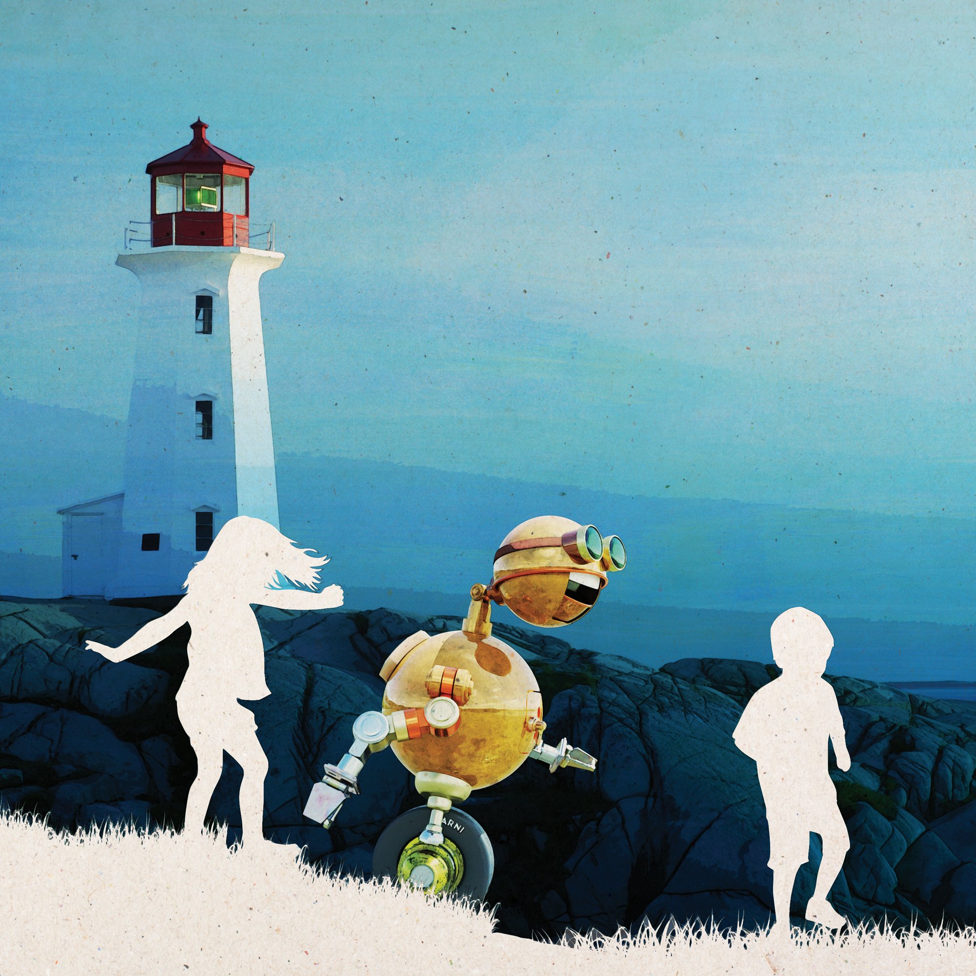
The character, a robot named BOB-e (pronounced: Bobbie or Bobby), was designed as a collage of robot parts that look as if they come from various decades. This gives the character a built in “history” and visual interest from any angle. Any view of the character features elements with different textures and simple shapes. This is especially important when viewed in an Augmented Reality application, where we have less control of how the viewer sees the character. The basic proportions are child-like. The robot isn’t intended to appear at all intimidating. It’s arm positions generally reinforce the idea that the robot is actively balancing on its one wheel. This physical attribute is intended to make the robot more vulnerable and relatable. Though a familiar “steam punk” design aesthetic was chosen, the colors are much brighter than is typical of the style. This was done to appeal to younger readers.
BOB-e, the robotic host of the upcoming book and Augmented Reality presentation “Water I Wonder”
Water as a part of work and economics
Water as a part of cultures & beliefs
A collage aesthetic was also incorporated into the book’s illustration style. All of the backgrounds are photos that I took or purchased. All of the foreground elements (that aren’t the robot) are rendered in silhouette. The robot itself was developed as a set of sketches and then realized as a fully animated 3D character. A great deal of care went into the robot’s posture and the way it moves.
The final hand drawn sketch of the robot just prior to 3D modeling
The robot went through several iterations until I arrived at the more or less gender neutral design that will appear in the book “Water I Wonder”
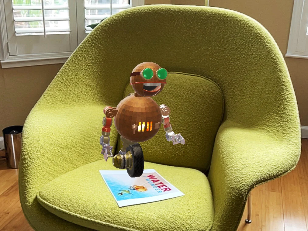
An early version of BOB-e in my favorite chair
A sketch of the AR presentation
“Water I Wonder” will be accompanied by an Augmented Reality presentation where the robot “reads” the book. Illustrations will accompany the robot as it recites the text.
Another view of this early version of BOB-e
Once the robot is sharing the same physical space as the viewer, we no longer control how they see it. BOB-e needs to make sense visually from any angle. The robot’s details need to look interesting enough to allow children to get very close to him. As the publication date nears, I’m becoming increasingly excited to see how the book and the Augmented Reality experience will compliment each other.
Water as a part of farming
The Robot was modeled and rendered in Blender. The hand drawn elements of the illustrations were drawn on an iPad using Adobe Fresco. The finished illustrations were assembled in Adobe Photoshop. The actual book was designed in Adobe InDesign. The Augmented Reality presentation is being designed in Adobe Aero.
TL;DR
Augmented Reality in a neat way for people to interact with literary characters.


